Sunday 15 November 2009
Drive By Fly By
Playing around with Adobe After Effects... I have created a short title sequence for a fictional Thriller entitled "Drive by Fly by" only using still images... just a bit of fun and still very rough around the edges, but you get the idea :o)
Thursday 5 November 2009
UBSU logo

This is a concept logo I have designed for the University of Bolton's Student Union. With the Student Union having such a wide a varied function, I felt it is impossible to include every element of the organisation into one logo. So I have simplified it down to a more basic explanation of them. I have based my design on the idea that the student union is there to support students day and night, with the yellow/orange representing daylight and the dark blue representing night time, the small lighter blue arrow shape to the bottom left symbolising "and in to the early hours too... sometimes".
The pantone colours used have been lifted directly from the current University of Bolton logo, to add an element of being within the University. The image above is from a page of the PDF presentation I have put together, obviously the finished logo itself does not have the guide lines and measurements.
Tuesday 6 October 2009
Brunel' Timeline
Pictured above is my first project of the 2nd year of my graphics degree. We were tasked to design a "triptych" exhibition stand for a fictional Brunel exhibition sponsored by the Design Museum.
Monday 24 August 2009
Saturday 22 August 2009
Thursday 9 July 2009
Letterheads and Business Cards

Letterhead and Business Card concept. A logo consisting of an arrow pointing up at an angle made up of small squares. The small squares that are not part of the arrow are printed, however, the arrow its self is made up of punched out square holes to add a twist to the design. A clean elegant san serif typeface finishes off the design for that professional look.
Tuesday 7 July 2009
Wednesday 6 May 2009
JTF logo...
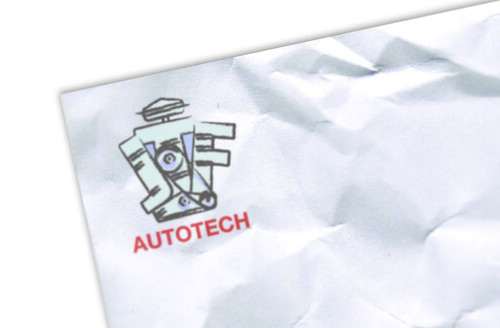
Logo designed for JTF Automech, a new automotive repair company, they wanted a tougne in cheek, fun design. After some variations around the theme this is the logo they decided upon.
Tuesday 5 May 2009
Whitworth Art Gallery Logo...
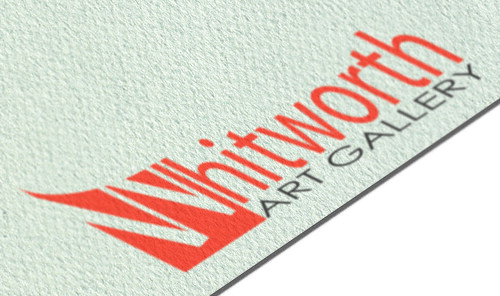
A concept logo I designed for the Whitworth Art Gallery in Manchester... got to be better than their current logo, look it up... its an awful design.
I based the 'W' part of the logo on the side elevation of the new-ish sculpture court at the gallery.
Thursday 23 April 2009
Inspired by.....
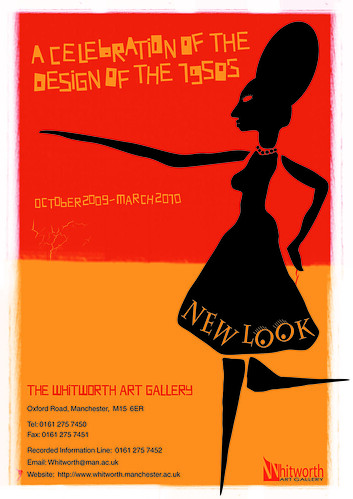 This is a poster I have designed for an imaginary exhibition taking place at the Whitworth art gallery in Manchester. The poster is to celebrate 1950s design, I have chosen one of my faviorite designers from that era, Saul Bass, for my inspiration for this design.
Tuesday 24 March 2009
Type as Image
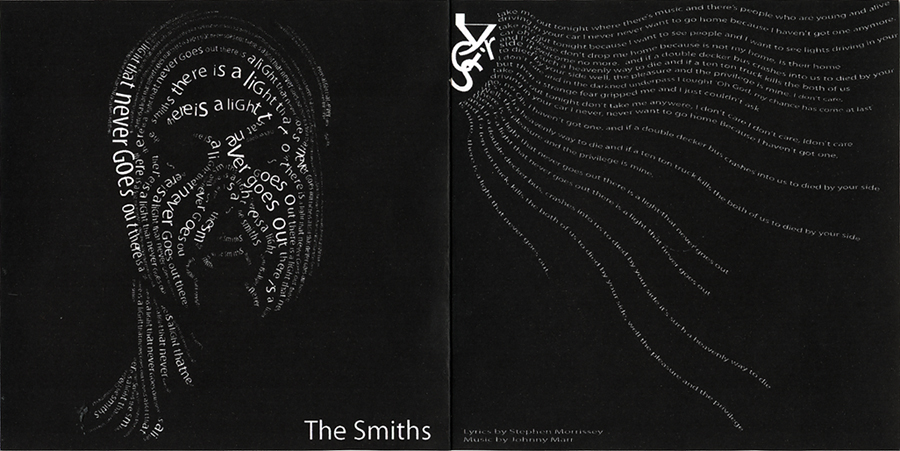 We were tasked at university to design a CD single cover for one of six songs, I choose 'There is a light that never goes out' by The Smiths. The brief stated we are not use any images, just type (type as image module).
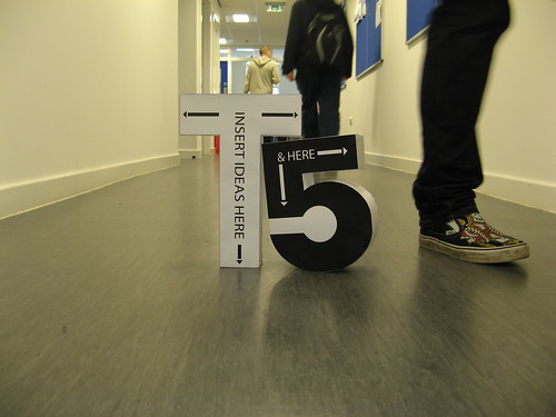
Use Imagination Here....
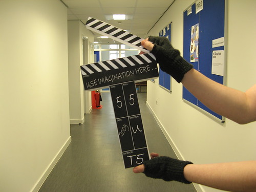 My Blue Peter moment... I put to use my skills with some paper, scissors and double sided sticky tape (got to love that stuff) to create this prop for use on the tfive website to symbolise the film & video course.
& Here...
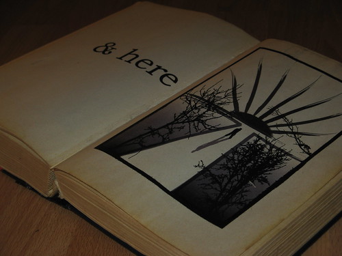
 Book Illustration for the tfive website. I based the illustration around my logo design for the website.
Subscribe to:
Posts (Atom)


