Wednesday, 30 June 2010

Reveal Diagnostics


Reveal Diagnostics create 3D scans of the head/mouth and large x-rays (but mostly 3D) for dentists placing implant crowns. It's like a CAT scan of the head/mouth, only higher resolution. This is a cutting edge technology (look up Sirona Galileos to see it) in an emerging dental market. Most high end dentists use or want to use this type of technology, but it's price is prohibitive. Reveal Diagnostics offer the scans without buying the entire scanning machine. They required a 3D logo that reflected the nature of their business.

Peterson, Krische & Van Horn DDS


PKV are a classy dental practice who requested a logo to reflect this. They required something a little outside of the box and away from the usual comic styled teeth and toothbrushes. This design reflects the ideal everyone wants for their teeth pure and natural like a pearl. The 3 pearls also represent the 3 doctors in your practice this combined with classic typography will give the right impression to new and existing patients and shows you are a well established practice. It will provide a feeling of confidence because they have dared to go for a logo which is a little more abstract and unique and do not need the usual clichéd dental logos of toothbrushes, teeth and cheesy smiles.

SEO Review Guide


This 3D logo was designed with an inspection aspect in mind. The focus of the SEO Review Guide is to provide advice, analysis, technical and marketing support to online businesses to help them make the most of their websites.

MAOTD


MAOTD is focused on building a community of platform-agnostic users and developers. Users can recommend and vote on applications, games, utilities, and any other mobile software. Developers can bring more attention to their product as well. Android, iPhone, Blackberry, etc. Because they are open to all platforms, the entire user and development community will be welcome. And as new platforms come out, they can roll them right into the fold and give those brave new users and developers greater opportunity to grow their base. This logo was produced to symbolise the daily review aspect of their website with an app type calendar icon forming the logo.

CSD


This new logo is the cornerstone of CSD new branding efforts as they plan to expand their business and launch their first website.

Sunday, 21 March 2010

Cubism

A project exploring the use of Trapcode Form in After Effects

Saturday, 13 February 2010

Illuminated Organics

My latest project is to create a short abstract animation based around one of a selection of title themes. I have chosen the title "Illuminated Organics". When I read this title I instantly had thoughts of the strange yet beautiful glowing creatures in the depths of our oceans, my animation centres around this concept.

This is my first draft and is in need of a few tweaks, but gives a good impression of how the animation will look once completed.

Due to youtubes obsessiveness with compression the picture quality is not perfect, so is best viewed in HD... and make sure you have your sound on


Sunday, 15 November 2009

Drive By Fly By


Playing around with Adobe After Effects... I have created a short title sequence for a fictional Thriller entitled "Drive by Fly by" only using still images... just a bit of fun and still very rough around the edges, but you get the idea :o)

Thursday, 5 November 2009

UBSU logo


This is a concept logo I have designed for the University of Bolton's Student Union. With the Student Union having such a wide a varied function, I felt it is impossible to include every element of the organisation into one logo. So I have simplified it down to a more basic explanation of them. I have based my design on the idea that the student union is there to support students day and night, with the yellow/orange representing daylight and the dark blue representing night time, the small lighter blue arrow shape to the bottom left symbolising "and in to the early hours too... sometimes".

The pantone colours used have been lifted directly from the current University of Bolton logo, to add an element of being within the University. The image above is from a page of the PDF presentation I have put together, obviously the finished logo itself does not have the guide lines and measurements.

Tuesday, 6 October 2009

Brunel' Timeline


Pictured above is my first project of the 2nd year of my graphics degree. We were tasked to design a "triptych" exhibition stand for a fictional Brunel exhibition sponsored by the Design Museum.

Monday, 24 August 2009

The little instruction manual to positive thinking


The little instruction manual to positive thinking, a print design for a self help pamphlet

Saturday, 22 August 2009

Rob Tomlin Photography


Logo design for Manchester based photographer Rob Tomlin.

Thursday, 9 July 2009

Letterheads and Business Cards


Letterhead and Business Card concept. A logo consisting of an arrow pointing up at an angle made up of small squares. The small squares that are not part of the arrow are printed, however, the arrow its self is made up of punched out square holes to add a twist to the design. A clean elegant san serif typeface finishes off the design for that professional look.

Tuesday, 7 July 2009

Concept logo for Genio Studio

Concept business card design.

Wednesday, 6 May 2009

JTF logo...


Logo designed for JTF Automech, a new automotive repair company, they wanted a tougne in cheek, fun design. After some variations around the theme this is the logo they decided upon.

Tuesday, 5 May 2009

Whitworth Art Gallery Logo...


A concept logo I designed for the Whitworth Art Gallery in Manchester... got to be better than their current logo, look it up... its an awful design.

I based the 'W' part of the logo on the side elevation of the new-ish sculpture court at the gallery.

Thursday, 23 April 2009

Inspired by.....

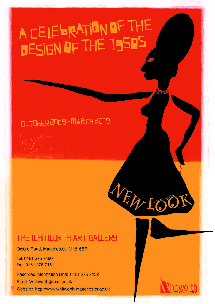
This is a poster I have designed for an imaginary exhibition taking place at the Whitworth art gallery in Manchester. The poster is to celebrate 1950s design, I have chosen one of my faviorite designers from that era, Saul Bass, for my inspiration for this design.

Tuesday, 24 March 2009

Type as Image

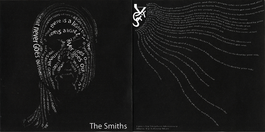
We were tasked at university to design a CD single cover for one of six songs, I choose 'There is a light that never goes out' by The Smiths. The brief stated we are not use any images, just type (type as image module).

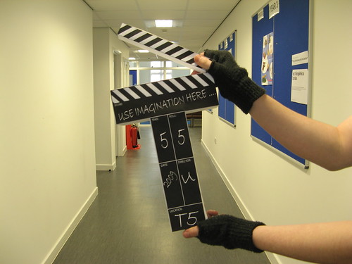
Use Imagination Here....

My Blue Peter moment... I put to use my skills with some paper, scissors and double sided sticky tape (got to love that stuff) to create this prop for use on the tfive website to symbolise the film & video course.